
Thinking about updating your home and in need of ideas? The right paint colour can completely transform a space, whether you’re freshening up a single room or planning a full renovation. Farrow & Ball’s 2025 collection introduces nine new shades designed to bring warmth, and character to any home—perfect for Southwest London’s mix of period properties and contemporary spaces.
From soft neutrals that brighten hallways to rich, grounding tones that create a cosy feel, these versatile hues offer practical solutions for modern living. Plus, three much-loved archive paints are set to make a return – let’s dive in and uncover the full depth of these brand new shades.
SCALLOP NO. 311
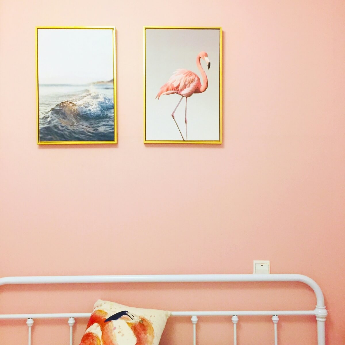
Scallop is a soft, creamy shade that offers a subtle alternative to pinks like Dead Salmon. It’s ideal for brightening hallways or creating a calm bedroom space. This versatile hue also adapts well to any lighting, giving the room a sense of character while also being careful not to take over the space.
DIBBER NO. 312
Dibber is an earthy, muted green that adds a natural vibe to any room. Inspired by a gardening tool, it fits perfectly in utility spaces like boot rooms or pantries, where it adds dimension without feeling heavy. Best used in rooms with natural light, Dibber helps create a more organic, relaxed atmosphere.

REDUCED GREEN NO. 313
Reduced Green is a rich, deep green with a touch of brown, offering a balanced, calming tone for any space. Whether you use it on your front door or in a study, this shade creates a sophisticated, quiet presence.
SIZING NO. 314
Sizing is a cool, blue-toned neutral that works well in rooms with less natural light. It’s a great option for north-facing spaces, adding a crisp, fresh scheme without making the room feel cold. Pair it with Scallop for a soft, harmonious bedroom or use it in a modern kitchen for a sharp, clean finish.
NAPERON NO. 315
Naperon is a warm terracotta with subtle yellow-pink undertones. It adds a relaxed, inviting vibe to modern living rooms or north-facing spaces, where it helps create a cosy atmosphere. Pair it with Dibber for a stylish up-to-date look or layer it with other terracotta shades for a more tonal approach.
MARMELO NO. 316
Marmelo is a rich, earthy orange that brings a welcoming, homely feel to any room. It works well for wall panelling, kitchen units or accent walls, giving spaces a cosy, lived-in quality. Marmelo deepens in low light but brightens up in natural light, making it a versatile option for a variety of rooms.
KAKELUGN NO. 317
Kakelugn is a fresh, pale blue inspired by Sweden’s tiled stoves. This soft hue is perfect for bedrooms, helping to create a calm, restful space and improve sleep. It works best in south-facing rooms, where it adds a bright, airy appeal. Whether on walls or woodwork, it brings a soothing touch to any space.
DOUTER NO. 318
Douter is a smoky grey-green that pairs well with both modern and classic interiors. It’s a great choice for adding substance to a room without it feeling too bold. Whether you go for a more traditional look with white trims or mix it with lighter shades like Scallop for a softer feel, Douter brings a sophisticated edge to any scheme.
DUSTER NO. 319
Duster is a deep ochre, a warm, muted yellow that sets a relaxed, welcoming tone. In bright light, it has a vibrant, cheerful quality, while in lower light, it softens to a deeper shade, making it a flexible option for any room. Whether in kitchens, small nooks, or bookshelves, it offers a natural, calming appeal.
FROM FRESH TO FAMILIAR: FARROW & BALL BRINGS BACK THREE BELOVED ARCHIVE SHADES
Alongside the fresh new shades, Farrow & Ball is also bringing back three iconic archive colours to their Signature Palette for the first time. These classic hues offer character and warmth, making them a great addition to any space. With their return, they perfectly align with the rich, nostalgic tones that are trending this year, and we’re sure they’ll be a hit with our South West London clients.
Click here to rediscover Etruscan Red, Broccoli Brown and Sap Green.
WHY CHOOSE THIS PREMIUM BRAND OF PAINT?
When it comes to transforming your home with paint, Farrow & Ball is the name to trust. With over 75 years of experience, their paints are designed not just to colour your walls but to enhance your entire home. Here’s why this brand of paint stands out:
UNMATCHED QUALITY & INGREDIENTS
The brand is dedicated to perfecting the art of paint. Using the finest ingredients and technical precision at their Dorset home, they create paints that go beyond just colour. The magic lies in the fact that less than 8% of the paint tin is the actual pigment. The remaining 92% is made up of carefully selected materials that contribute to the paint’s intensity, richness, and exceptional reaction to natural light. This perfect blend of ingredients ensures your walls remain beautiful, with lasting vibrancy.
BRILLIANT LIGHT REACTION
Each hue from the company is designed to respond beautifully to changing illumination throughout the day. The pigments are carefully crafted to bring out complex undertones, so a space that feels bright and airy in the morning can shift to warm and intimate by evening. This interaction with light is what makes their paints so unique, giving your home an ever-evolving atmosphere that enhances your space at any time of day.
RICH, COMPLEX PIGMENTS
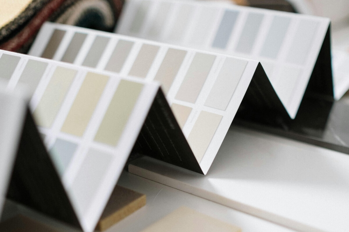
Likewise, the brand’s paints are packed with rich pigments, creating deep palettes with complex undertones. These aren’t just colours on a wall—they’re moods that change as the lighting shifts. Whether you’re looking to create a bright, airy room or a cosy, grounded space, Farrow & Ball offers shades that balance effortlessly in any setting.
VERSATILE FINISHES FOR EVERY SURFACE
From walls, floors, and furniture to radiators, skirtings, and sheds, Farrow & Ball’s range of finishes can transform almost any surface in your home. Whether you’re tackling interior or exterior surfaces, their multi-surface finishes—like Dead Flat® and Full Gloss—give you the flexibility to paint walls, woodwork, and metal all at once.
HIGH-PERFORMANCE COVERAGE
Farrow & Ball paints don’t just offer striking aesthetics—they’re built to perform. Designed to pair perfectly with their premium Primers and Undercoats, these paints provide excellent coverage, strong adhesion, and a rich, lasting colour. With this combination, you can trust that your walls will look stunning and stay vibrant over time, without compromising on quality or durability.
ACHIEVE STUNNING RESULTS WITH OUR PROFESSIONAL HELP
Farrow & Ball’s high-quality finish is the perfect choice for any renovation. At Kluk Construction, we’re experienced in using this premium paint to achieve lasting results with every project. From walls to woodwork, we know how to get the best from every surface.
Ready to bring your home to life? Get in touch today to start your renovation with the right team and the right paint.
All images in this post are stock images used solely for illustrative purposes.
